
Introduction
In this report, we are showcasing our data science capabilities. The capabilities include extracting data from various different data formats and structured and unstructured data types into knowledge database. The report presents data visualization from data as is available through the sourced data sources.
(Last Update: 05/03/2020 – Work is done with collaboration with Petacube)
We will describe data sources, methodologies, and terminologies that we have created to visualize the data.
Data Source
The sources of the data are:
- COVID-19 Hopkins University data
- Massachusetts State website (mass.gov) and local town websites
- Reference Data Source – Wikipedia
Methodology
Our capability is too take any type of data format both structured and unstructured, process those data files and produce structured data set. Once we have structured data set that is our observations, then we can apply reference knowledge.
An example of reference knowledge is Massachusetts town location and their populations. We extracted this reference data from Wikipedia. Now, we can use this reference data display COVID-19 data either in the map or normalize the COVID-19 data with population.
Once we apply reference knowledge to the observations, we have domain level knowledge graph. At this point, the data set is ready for AI/ML models as well as standard statistical analysis. In this report, we are using standard models and charts to describe COVID-19 in various different countries and US states.
In summary, there are three major stages in processing data. These stages are standard regardless of nature of the data. Those stages are:
Stage 1 source and extract data from various data formats (both unstructured and structured) to observations (structured data).
Stage 2 apply reference knowledge to the observations
Stage 3 create knowledge graph which is ready for the data science and analytical work
Stage 4 you can start doing your analysis and Data Science. Since this is a clean data, Data Scientist may develop model to discover new features as well as inferences.
Terminology
John Hopkins University COVID-19 data set contain following three major components. These are cases reported by each entity based on their testing on daily basis.
- Confirmed – COVID-19 Positive
- Deaths – Death due to illness
- Recovered – Patients recovered from COVID-19
We have created is simple measure of ratio “Infection Ratio.” Let infection ration be IR and confirmed cases be Xi and i = 1…n, then
IR = Xn/X(n-1)
that is today’s observation of confirmed cases divided by yesterday’s confirmed cases.
This ratio is a very simple of how today’s confirmed cases are different from yesterday. For example if ration is 1, then there is no change in cases reported. The ratio does not provide any indication of absolute cases. Absolute cases may be different in sizes such as 1000 or 10, and the ratio may be 1 for both. Thus, the ratio is indicative of changes in reported cases for two consecutive days.
If the cases are increasing, then the ratio will be greater than 1. If cases doubled today from yesterday, then the ratio is 2.
If the confirmed cases are half today compared to yesterday, then the ratio will be half.
Thus, this is a crude measure of variability of reported cases. In the beginning, we shall see ratio fluctuating as tests and reports increases. Then, we shall observe a steady state of ratio hovering around 1 indicating steady state in testing and reporting. However, this is not an indicator of any inference from the data.
Modeling
Once we have the knowledge graph, AI/ML and analytics may be conducted. One type of statistical analysis that we have complete is to run Autoregressive (AR) model with various different lags on the confirmed cases for Massachusetts data.
COVID-19 Data Visualization
We have created charge for you is as a whole, top five US states and Massachusetts. As we are local to Massachusetts and the state being one of the hot spot, it is interesting to see trends and also compare with other states.
We have extracted three key data fields. They are Confirmed cases, reported Death, and patients who have Recovered. These data are reported in a daily basis.
US
US Aggregate
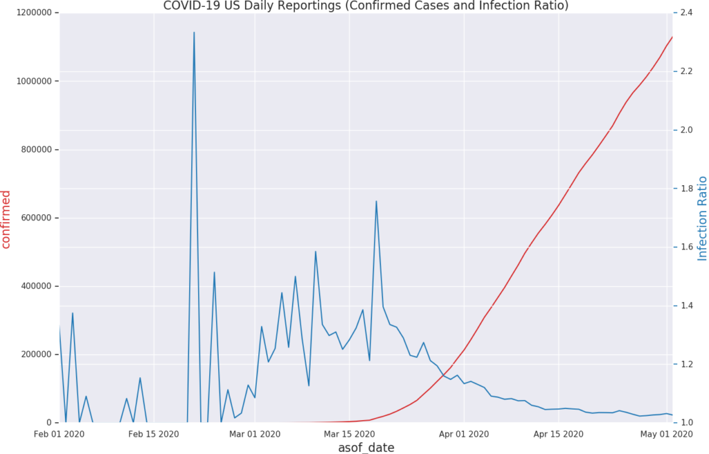
Above chart shows confirmed cases in US as a whole (red line). The blue line is “Infection Ratio” which shows variability in the early stage and then conversing to steady state .
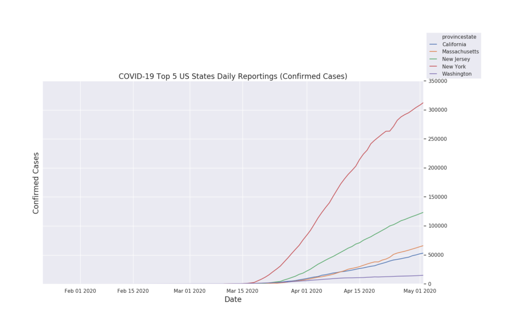
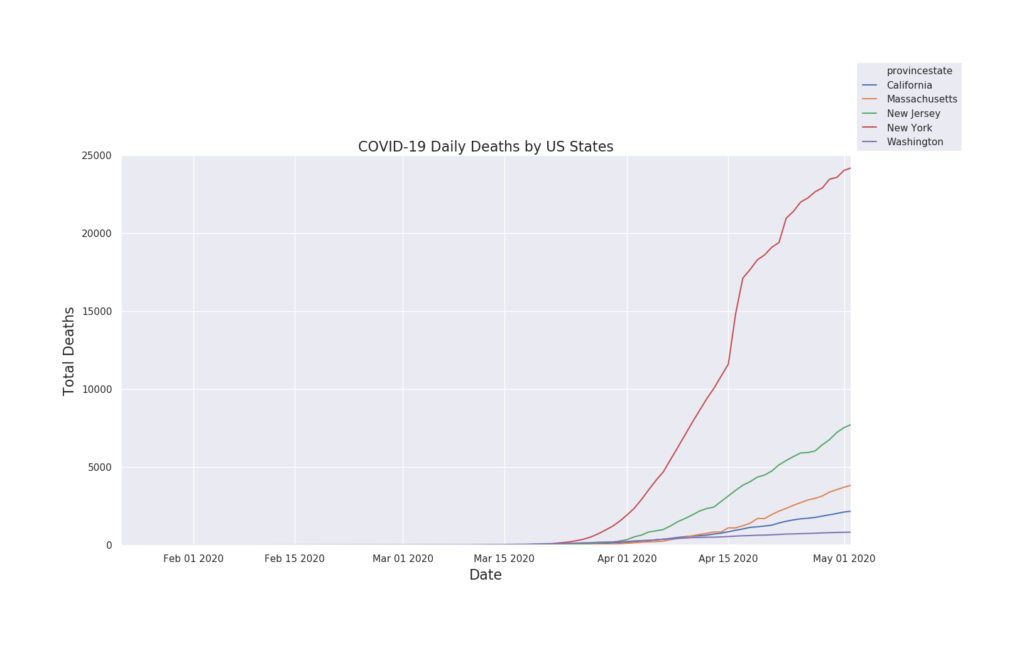
Top 5 US States
The chart visualizes CA, MA, NJ, NY, and WA states.
Confirmed Cases –
Reported Deaths per state –
Infection Ratio per state –
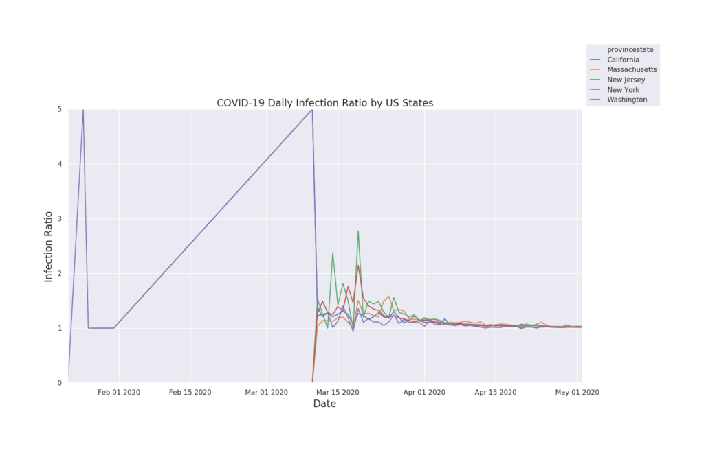
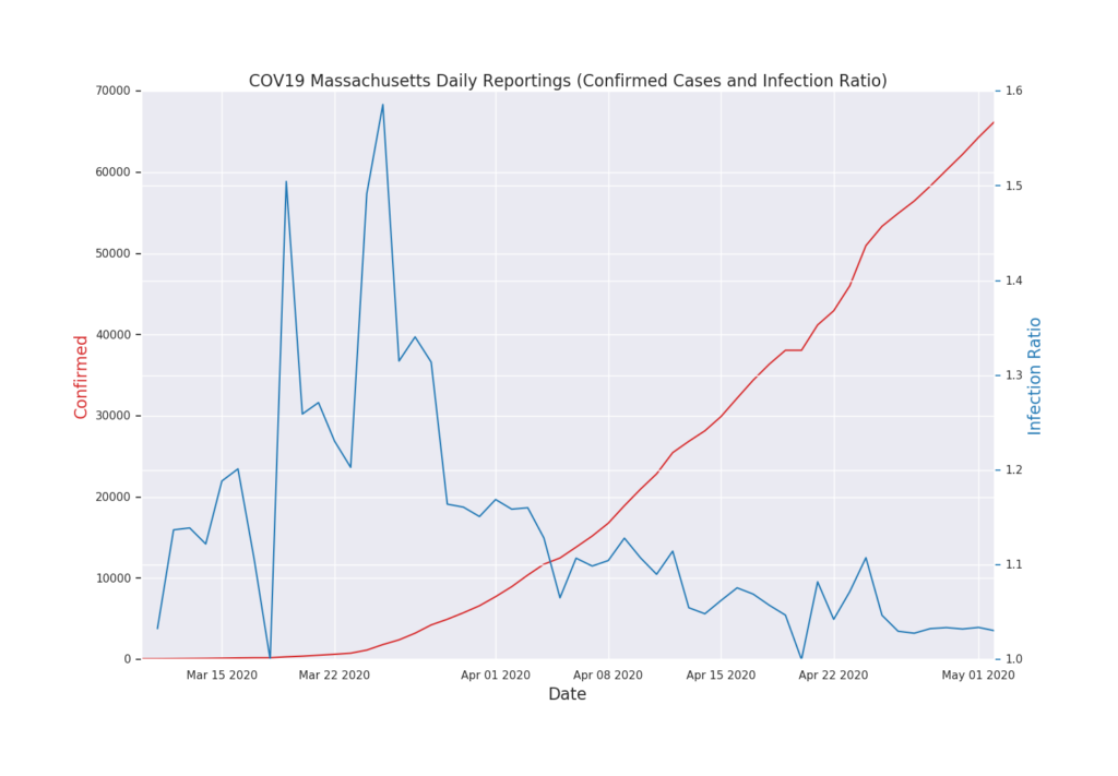
Above chart shows confirmed cases in US as a whole (red line). The blue line is “Infection Ratio” which shows variability in the early stage and then conversing to steady state .
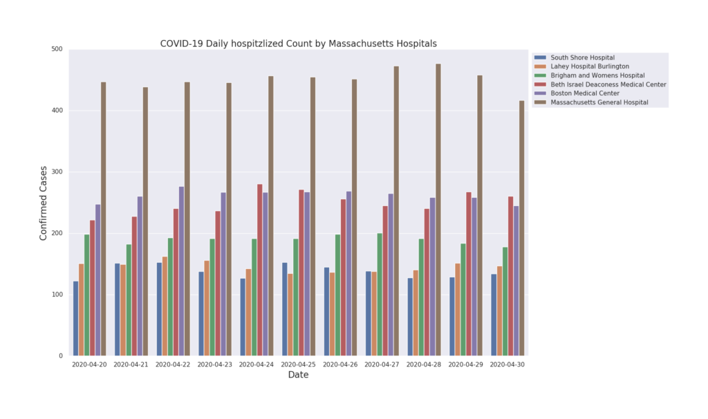
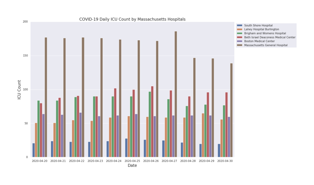
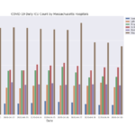
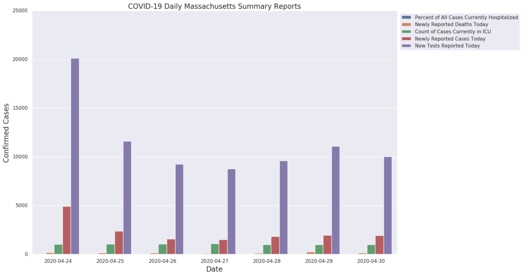
Above chart shows cases reported by hospital. Mass.gov has published a PDF of the above data. Our process was able to read the PDF content, extract the data and then convert into structured data set. Since, we have Massachusetts town data from Wikipedia, we can visualize in map or normalized to population data.
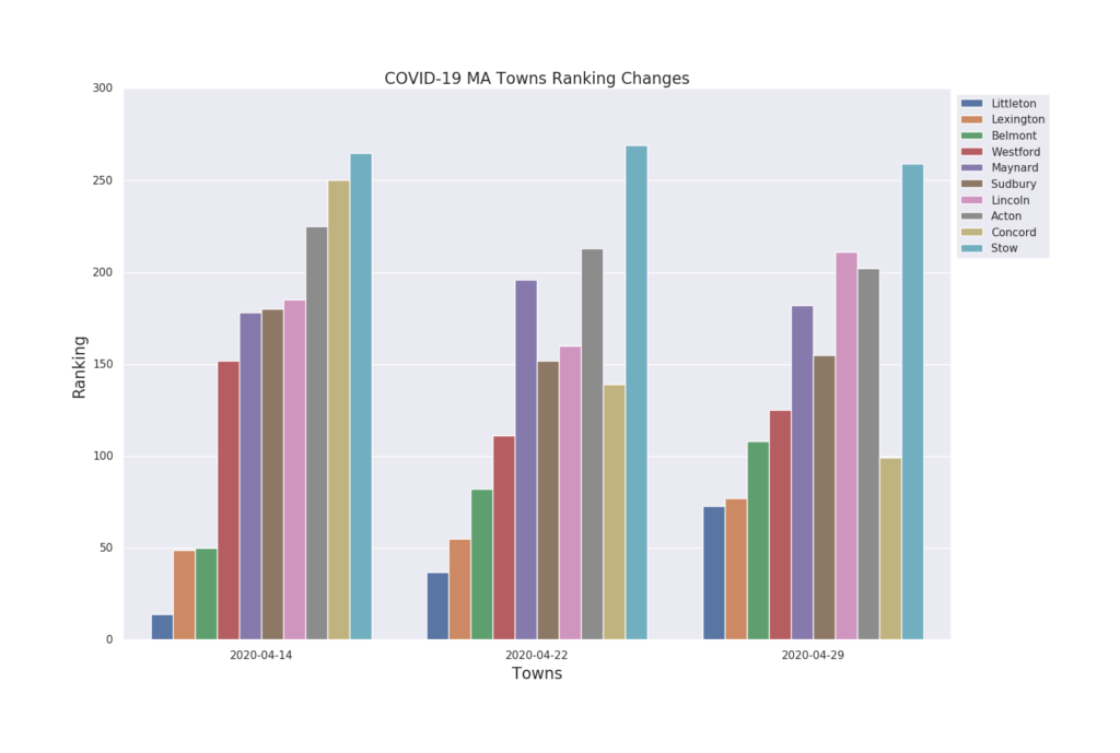
Above chart shows cases reported by town. Local towns as well as Mass.gov have published the data. Our process was able to read the PDF content, extract the data and then convert into structured data set.
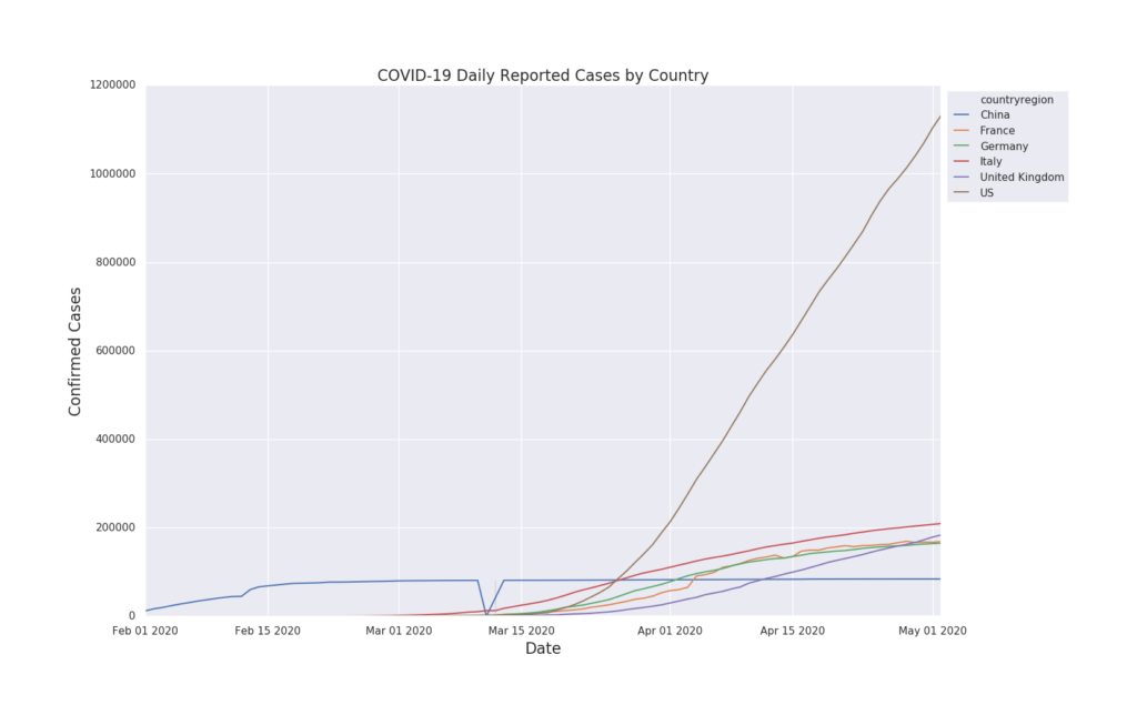
Six Countries Comparison
We have data for the world; however, visualizing countries – China, France, Germany, Italy, UK, and US.
Confirmed Cases:
Infection ratio by country –
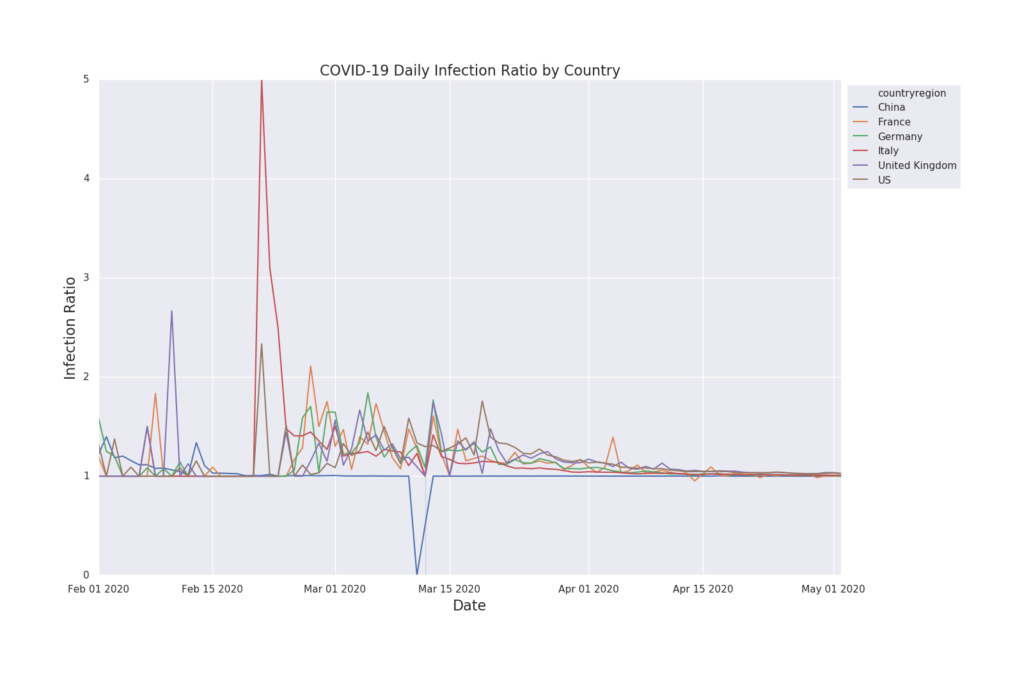
Above chart shows that countries are converging to a steady state on changes on cases per day.
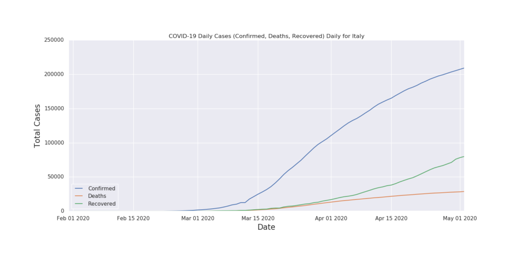
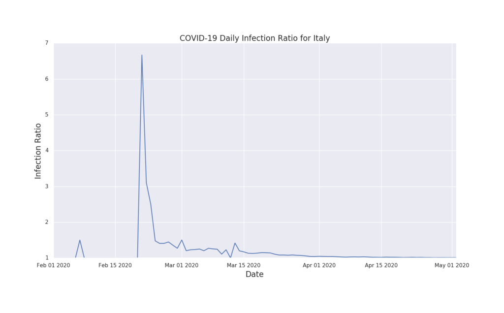
Italy
Confirmed cases, Deaths and Recovered
Infection Ratio –
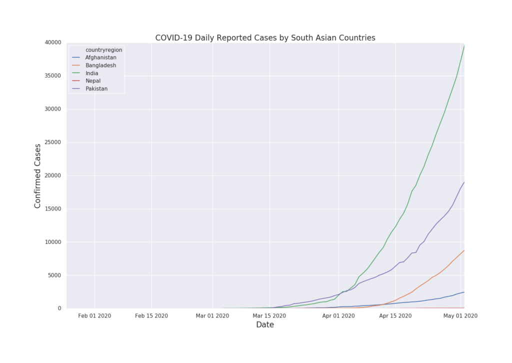
South Asian Countries
South Asian countries that are connected by land – Afghanistan, Bangladesh, India, Nepal and Pakistan.
Confirmed cases –
Infection Ratio –
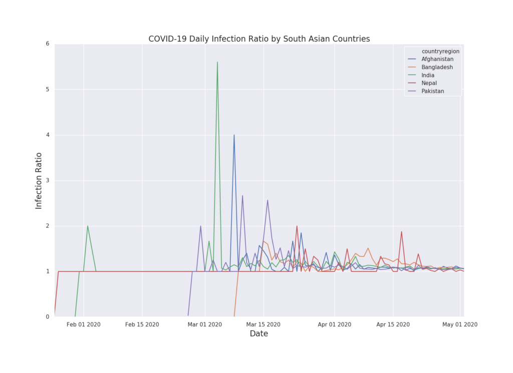
Above chart shows that South Asian countries are beginning to converge to a steady state on changes on cases per day. As we have seen on other countries data, initial state of virus spread, the ratio variability are high.